# Input 输入框
输入框,可附带前缀、后缀图标, 可设置禁用状态,可自定义样式
# 默认输入框
<zhb-input placeholder='请输入关键字'></zhb-input>
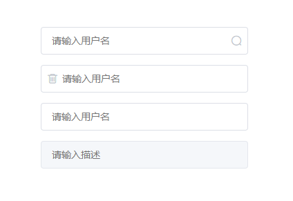
# 带后缀的输入框
<zhb-input placeholder='请输入关键字' suffixIcon="{{suffixIcon}}"></zhb-input>
# 带前缀的输入框
<zhb-input placeholder='请输入关键字' prefixIcon="{{prefixIcon}}" suffixIcon="{{suffixIcon}}"></zhb-input>
# 禁用状态的输入框
通过 `disabled` 属性指定是否禁用 input 组件

<zhb-input placeholder='请输入关键字' disabled></zhb-input>
# 带有清空按钮的输入框
<zhb-input placeholder='请输入关键字' clearable></zhb-input>
# Attributes
| 属性 | 说明 | 类型 | 默认值 |
|---|---|---|---|
| value | 输入框内容 | String | - |
| type | 输入框类型(目前支持 text number password phone(电话号码) bankCard(银行卡号) amount(金额) | String | text |
| placeholder | 占位 | String | - |
| disabled | 是否禁用 | Boolean | false |
| prefixIcon | 带有前缀图标的input | String | - |
| suffixIcon | 带有后缀图标的input | String | - |
| @change | 监测数据改变事件 | function | - |
← Button 按钮配置 Radio 单选框 →