# Dialog 对话框
在保留当前页面状态的情况下,告知用户并承载相关操作。
# 基础用法
Dialog 弹出一个对话框,适合需要定制性更大的场景。
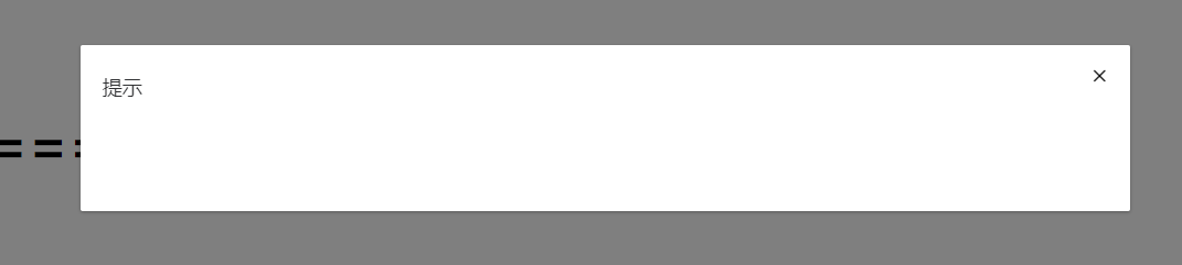
    <zhb-dialog :visible.sync="visible" >

    </zhb-dialog>
    <script>
      export default {
        data() {
          return {
            visible: false
          };
        }
      };
    </script>
# 自定义内容
Dialog 组件的内容可以是任意的。
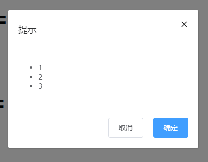
需要设置visible属性,它接收Boolean,当为true时显示 Dialog。Dialog 分为两个部分:body和footer,footer需要具名为footer的slot。title`属性用于定义标题,它是可选的,默认值为空。
    <zhb-dialog  width="20%" top="50px" :visible.sync="visible" >
        <ul>
          <li>1</li>
          <li>2</li>
          <li>3</li>
        </ul>
        <!--自定义底部-->
        <template v-slot:footer>
          <zhb-button  @click="visible = false">取消</zhb-button>
          <zhb-button type="primary" @click="visible = false">确定</zhb-button>
        </template>
    </zhb-dialog>

    <script>
      export default {
        data() {
          return {
            visible: false
          };
        }
      };
    </script>
# Attributes
| 属性 | 说明 | 类型 | 默认值 |
|---|---|---|---|
| visible | 对话框是否可见 | Boolean | false |
| title | 标题 | String | 提示 |
| width | 宽度 | String | - |
| top | 距离顶部 | String | - |
| modal | 是否显示遮罩层 | Boolean | true |