# Button 按钮
按钮组件,提供了不同样式的按钮,可自定义样式
# 基础用法
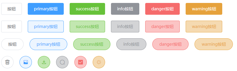
使用type、plain和round属性来定义 Button 的样式。
::: demo
<div>
  <zhb-button>默认按钮</zhb-button>
  <zhb-button type="primary">主要按钮</zhb-button>
  <zhb-button type="success">成功按钮</zhb-button>
  <zhb-button type="info">信息按钮</zhb-button>
  <zhb-button type="warning">警告按钮</zhb-button>
  <zhb-button type="danger">危险按钮</zhb-button>
</div>
<div>
  <zhb-button plain>朴素按钮</zhb-button>
  <zhb-button type="primary" plain>主要按钮</zhb-button>
  <zhb-button type="success" plain>成功按钮</zhb-button>
  <zhb-button type="info" plain>信息按钮</zhb-button>
  <zhb-button type="warning" plain>警告按钮</zhb-button>
  <zhb-button type="danger" plain>危险按钮</zhb-button>
</div>
<div>
   <zhb-button round plain>圆角按钮</zhb-button>
   <zhb-button round plain type="primary">primary按钮</zhb-button>
   <zhb-button round plain type="success">success按钮</zhb-button>
   <zhb-button round plain type="info">info按钮</zhb-button>
   <zhb-button round plain type="danger">danger按钮</zhb-button>
   <zhb-button round plain type="warning">warning按钮</zhb-button>
</div>
<div>
  <zhb-button circle>圆形按钮</zhb-button>
  <zhb-button type="primary" circle>主要按钮</zhb-button>
  <zhb-button type="success" circle>成功按钮</zhb-button>
  <zhb-button type="info" circle>信息按钮</zhb-button>
  <zhb-button type="warning" circle>警告按钮</zhb-button>
  <zhb-button type="danger" circle>危险按钮</zhb-button>
</div>
# 禁用状态

按钮不可用状态。
::: demo
<div class="row">
    <zhb-button disabled>禁用状态</zhb-button>
    <zhb-button disabled>按钮</zhb-button>
    <zhb-button disabled type="primary">primary按钮</zhb-button>
    <zhb-button disabled type="success">success按钮</zhb-button>
    <zhb-button disabled type="info">info按钮</zhb-button>
    <zhb-button disabled type="danger">danger按钮</zhb-button>
    <zhb-button disabled type="warning">warning按钮</zhb-button>
</div>
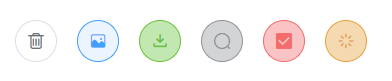
# 图标按钮
带图标的按钮可增强辨识度(有文字)或节省空间(无文字)。
设置icon属性即可,icon 的列表可以参考 zhb-ui 的 icon 组件,也可以设置在文字右边的 icon ,只要使用i标签即可,可以使用自定义图标。
::: demo
 <zhb-button icon="iconshanchu2" circle plain></zhb-button>
 <zhb-button icon="icontupian1" circle plain type="primary"></zhb-button>
 <zhb-button icon="iconxiazai" circle plain type="success"></zhb-button>
 <zhb-button icon="iconsousuo-02" circle plain type="info"></zhb-button>
 <zhb-button icon="icongouxuan" circle plain type="danger"></zhb-button>
 <zhb-button icon="iconjiazai1" circle plain type="warning"></zhb-button>
# Attributes
| 参数 | 说明 | 类型 | 可选值 | 默认值 |
|---|---|---|---|---|
| type | 类型 | string | primary,success,warning,danger,info | — |
| plain | 是否朴素按钮 | Boolean | — | false |
| circle | 是否圆形按钮 | Boolean | — | false |
| round | 是否圆角按钮 | Boolean | — | false |
| disabled | 是否禁用状态 | boolean | — | false |
| icon | 图标,已有的图标库中的图标名 | string | — | — |
← Icon 图标 Dialog 对话框 →